


© Against Time 2024

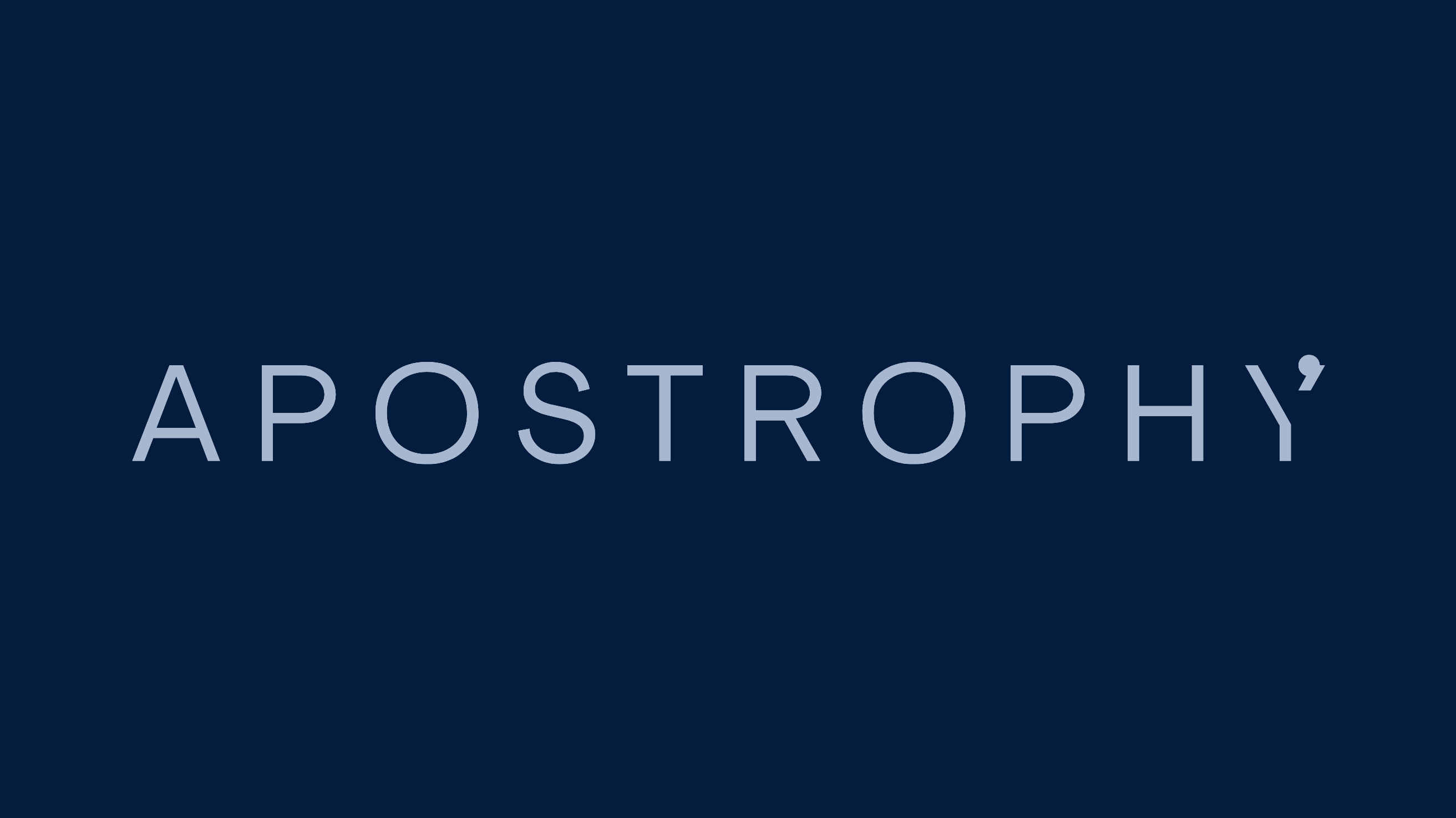
Apostrophy
Brand Identity
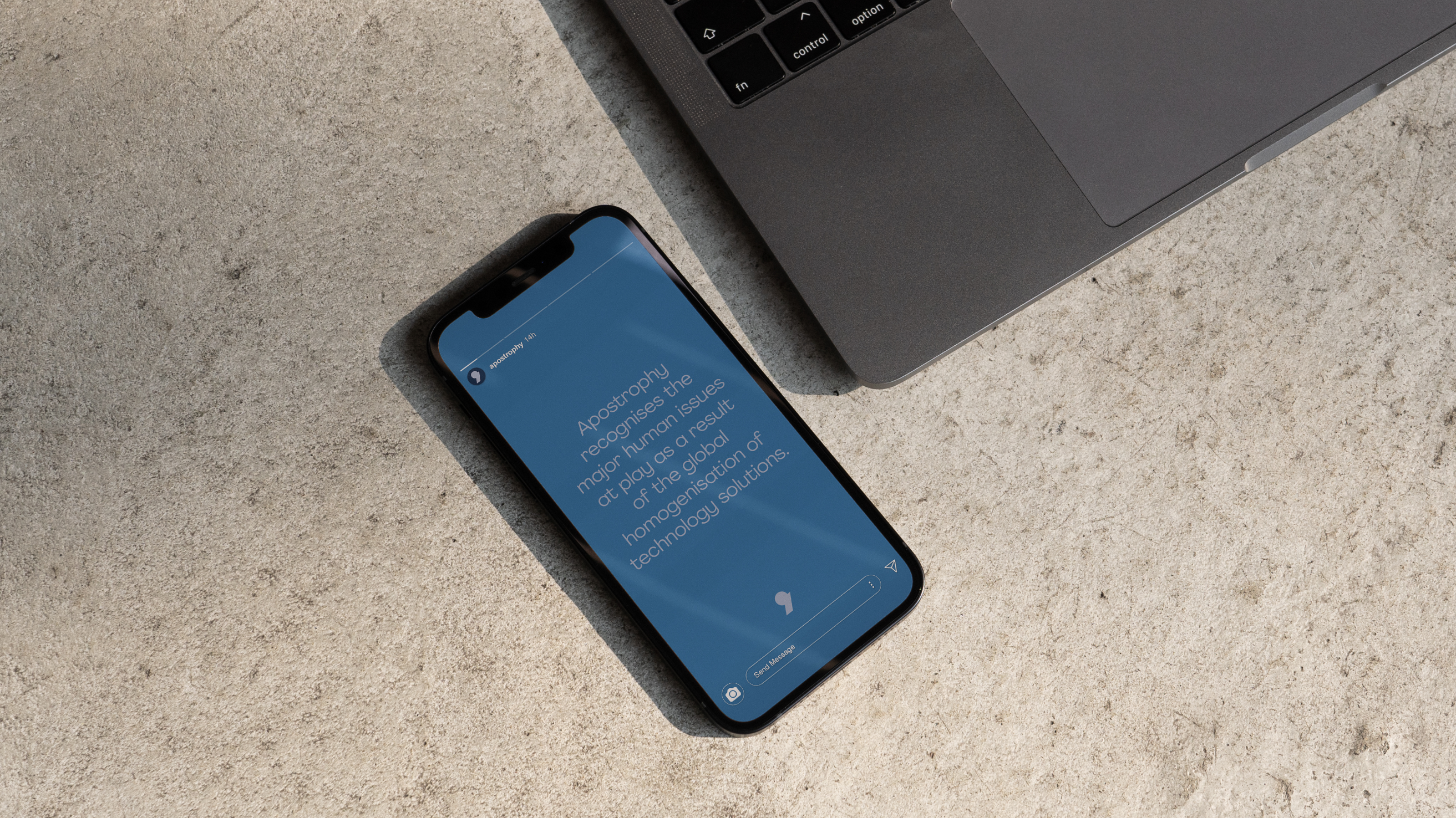
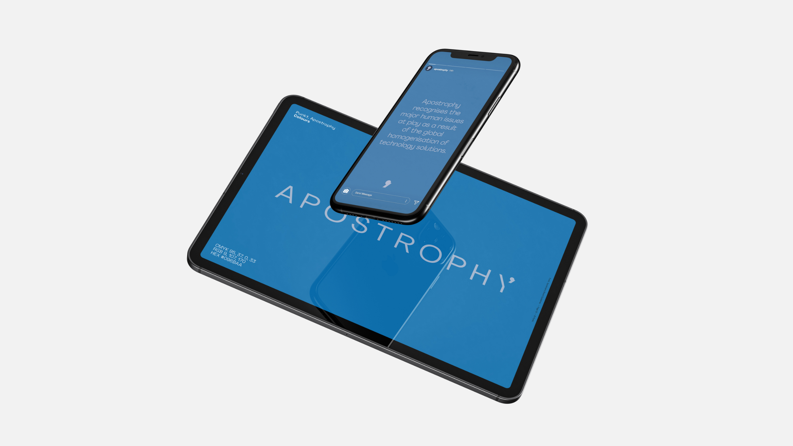
“Apostrophy recognises the major human issues at play as a result of the global homogenisation of technology solutions. We are driven but understand that the best way to tackle these problems starts with human interaction and ends with considered solutions.”
We were asked to create a brand identity for the new operating software.
Apostrophy has been created to challenge the current state of play in the technology marketplace, with a limited range of options available for mobile operating software. They wanted to offer more human-centric technology solutions, by decentralising the OS options and putting forward a considered alternative in Apostrophy.
We undertook strategic work to discover Apostrophy’s brand archetypes, so that we could build a thoughtful and cohesive brand identity that communicates their distinct core values.
Leaning into the outlaw and innocent brand archetypes we developed an identity that feels sophisticated but humble. Pairing the minimalistic icon and wordmark with a cool and calming colour palette we were able to evoke the brand’s human centric approach to technology whilst having a refined poise.
(Back to Portfolio View)